Indie genre conventions: artist may not appear in videos, dark lighting, artistic/ symbolic/ abstract
Pop genre conventions: artist appears in video/ mimes lyrics, mainstream clothing, dancing, narrative/ storyline, bright lighting, performance
I then researched into indie pop artists such as:
I viewed their music videos and then did deeper research into female artists of this genre or similar. I practised drawing a storyboard for 'Spectrum' by Florence and the Machine and at this point was interested in using this song for my music video. However, I kept researching and decided not to use this as it already had a music video and I did not want to be influenced by what had been created. So I researched further, found and chose the song 'Haunted' by Taylor Swift. Although this artist has a more country pop background I felt the song was darker, unlike her many pop songs and decided this was good as I could use indie-pop conventions. The song did not have an official music video yet and I thought this was great as it would allow me to try and interpret how the artist is feeling in the song and how they would portray this. I also chose the song due to the narrative content in the lyrics. I wanted to use conventions from both indie and pop genres, and so having narrative reflects the pop genre. I would be able to produce a video that could be watched as a short story but could also include abstract, indie style scenes. I then researched further in to the conventions of the indie pop genre.
I found a live performance and a piece of album artwork by the original artist. I used these as influential texts- the live performance allowed me to see how the original artist may be feeling or how she moves and expresses herself during the song. The artwork allowed me to be inspired by the location and style of costume for the music track. I also found Taylor Swift's own comments about her song and while analysing the lyrics for myself I found other people's interpretations online too. I also looked at 'Anything can happen' by artist, Ellie Goulding and gained audience feedback from this. This helped me to start producing my own ideas about how I would construct my video.
In what ways does your media product use, develop or challenge forms and conventions of real media products?
Music Video
I created a title clip after researching into music videos with titles. I decided I would like to use one because it gives the effect that the video is like a short movie- my music video tells a story and with a story comes a title.
File ---> New ---> Title
This link below shows a video tutorial of how to add titles in Adobe:

I used a title at the beginning to show the name of the song. I used this after seeing indie music videos such as The Naked and Famous 'Young Blood':
 I experimented with different fonts, colours and sizes of the title "Haunted" until I was happy with the outcome:
Performance and lip syncing is a big convention of pop music videos and so I decided that I should definitely include this. When analysing indie-pop music videos, I found that many solo female artists perform their songs and have a lot of coverage of themselves. After practicing the editing technique with a track and my little sister singing, this made me feel more comfortable at using it in my real piece. It is very important that the music clips and video clips are in-line correctly so that overall it looks realistic and effective. Below are screenshots from my project of clips that include lip syncing:


I chose my locations to fit with the lyrics/ narrative of the track. For example, I used a house location when representing the relationship scenes. I also chose a woodland location for scenes that I wanted to represent my artist's emotions. In many indie/ indie-pop videos outside locations are used:


Types of shots I used (conventional to indie/pop):
For some clips I edited the speed to fit the music. I did this by speeding up certain clips and slowing others down. For example: I slowed the speed of the clip where my singer throws water at her boyfriend- this makes the clip more interesting to look at, creates an impact effect and fits to the music better.I also slowed down the clip where my singer pushes her boyfriend and also where she is swaying her shawl. The video below shows how I also speeded up clips. I increased the speed on the beginning and ends of the pan by 300% but slowed the middle to 50%.
Right click on clip ---> Speed ---> Change speed percentange (for example: 50% slower/ 200% faster)


Slow Motion example from music video:
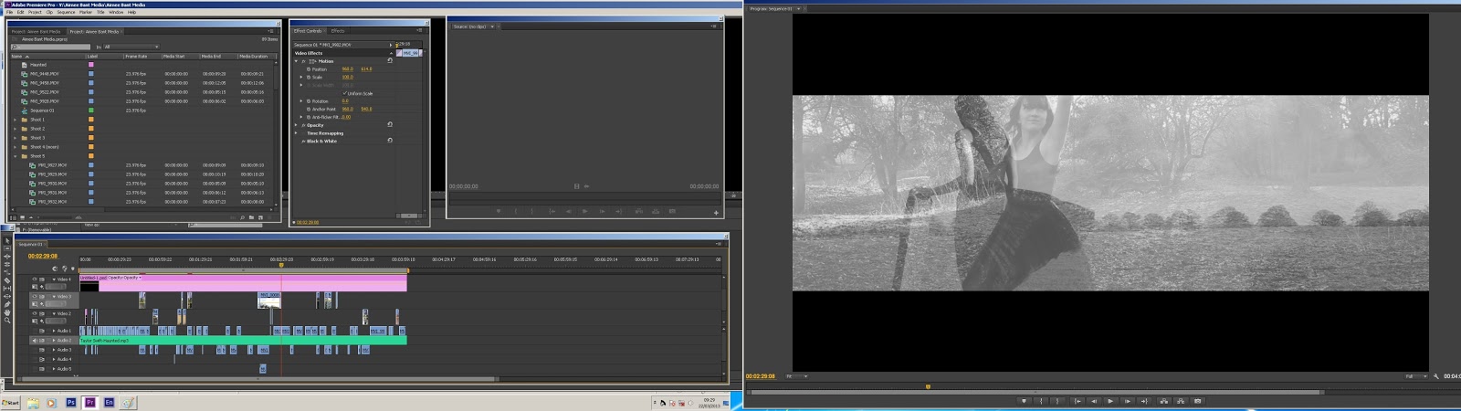
For some scenes I used two clips merged together. I believed this really gave my video an indie feel as the scenes are abstract/ arty looking. The first time I used this technique I added the first clip in of the boyfriend dropping the photo and then added the clip of the girl singing on top- reduced opacity so that I could see both at the same time- changed size of the clip of girl:


The second time I used this technique was in my later shoot of my artist at the woodland location. I originally wanted to include a fully choreographed dance in my video, however due to time I was only able to film a few shots of her dancing. I merged this shots with landscape shots of the woodland/mill area.
I also used metric/ rhythmic cutting. In part of my music video- I expanded my ideas and added a clip I didn't originally script for. 'Somethings made your eyes go cold'- I added in the clip of the boys eyes but then decided to 'flash' a clip of the singers eyes in too. I did this by shortening the clip and adding it on top of the first clip- I then added dissolve effects at the beginning and end of it so when it would pop up it wouldn't look so harsh. The screenshots below are from this section:
For the opening of my music video (first 30 seconds) I decided to use really quick shots- this would allow a story to be told quickly and allow the viewer to see a general idea of what the rest of the music video is about. I filmed these shots longer but edited them down to about a second per shot (metric cutting).
I also used rythmic editing in the clip below. I shortened and placed the shots so that they would change to the beat of the music. This is an example of a 'rythmic montage'.
As my music video includes both narrative and abstract themes I decided to use continuity style editing for the narrative. Below shows an example from my music video:
.jpg)

I have also challenged conventions. For example; I edited my music video in black and white even though this is not a well known convention of the indie-pop genre. My inspiration came from 'My immortal' by Evanescence due to the artist being a female solo artist. This video really influenced me as I loved the use of black and white. I decided to shoot my video in colour and experiment with the saturation whilst editing. I found that it looked better in black and white and it also meant that colour in a shot would not distract the audience from the main subject. Even though this is not a typical convention of my genre I believe that the video looks improved with this effect compared to without. I decided that I preferred the simplicity the black and white gave the video- there are no colour distractions. The black and white colouring could also relate to the song- haunted- for example: there is no colour which could connote death and the song is about the 'death' of her relationship.
Editing technique:
Effects ---> Video effects ---> Image Control ---> Black and White

Ancillary Texts
DIGIPAK/ DELUXE EDITION:
FRONT COVERS

BACK COVERS

INSIDE COVERS

POSTER

Website I used to create QR Code:

I also created a TV advert to advertise my video. I thought this was a great idea as it uses the actual video I have created to advertise the artist. This advert could be used not only on television but also on YouTube for 30 seconds before other music videos. The advert could even click through to my artists own YouTube channel. I looked at a few TV adverts, such as for Taylor Swift's 'Red' album and picked out the conventions. The main conventions I found were:
- voice over
- CD cover shown
- artist in music video shown
- text to advertise
- Stores available
I also included the artists website address in my advert. I think my advert could be improved a lot more. For example, it could show other music videos by the artist but I did not have the material to do this. If I did this again in the future I would definitely use a professional voice-over and improve the quality of the sound. The microphone I used was low quality and so the speech was very quiet compared to the original sound track- this meant I had to decrease the soundtrack a lot to allow the voice to be heard.
Screenshots of TV advert:
Screenshots of TV advert:

How effective is the combination of your main product and ancillary texts?
I created my ancillary texts in theme with my music video. For example, I used the same colour scheme of black and white. This allows people to recognise easily the link between the advertisements and the main music video. I also used images from the same photo shoot for my poster and digipak designs. The images include my artist in the same costume and location she performed the music video in. I think this is important because it shows the continuity between all the texts I have created. This was also recognised in my audience feedback as a positive.
Although the TV advert I created was not a main ancillary text I believe it is a perfect example of how the combination of my main product matches my advertising. The advert used shots straight from the music video and used the same text design. The title 'Haunted' that you see in the music video is the same text/ colour as the titles in the advert ('Lizzie Frost' and 'Haunted'). Also, the use of the iTunes and HMV logos is the same in my poster and this TV advert. I also used the same logos in the advertisements I created in Photoshop (e.g. bus posters).
On my poster and TV advert I also used the image of the album picture. This shows the audience what the album actually looks like so they are able to look out for it in stores or online. This is a convention of posters and TV advertisements, for example the posters below show how celebrities have used their album images for their advertising:


What have you learnt from your audience feedback?
I have learnt a lot from my audience feedback. I gained feedback for both my music video and my ancillary texts from a range of ages but mainly my target audience age and gender. (9 people) For example, I created video feedback asking questions about my music video:
1) Did you enjoy the music video? Were there any particular parts you enjoyed the most?
2) What genre of music did you think the music video was representing?
3) Did you think it represented the indie-pop genre well?
4) Did you understand the narrative of the music video?
5) What do you think could be improved?
Breakdown of video feedback:
100% of my audience said they enjoyed watching the music video
Particular parts enjoyed:
- Black Mill- artist running across hill (described as evocative)
- The picture being ripped and thrown into air/ picture of boy blow out at the end of the video
- use of black and white/ camera angles
- flashback scene (bench)
- Artist stood with dress blowing in wind
- kept viewer entertained, even though it was a long video
- the quality of video
- 100% understood the narrative of the video- however could use a different model/ different camera angle for the 2nd boyfriend to be more clear that it is a different person
- lip sync was good
- dark shot of boys eyes could be lightened/ girls could be clearer (1:06 - 1:09)
- flashbacks could be in colour
- lip sync (2:00 - 2:05) could be improved, but not that noticeable
- dance scene could relate more to the song/story (2:26 - 2:37)
Gaining audience feedback has really helped me to see what could be improved. After working on my video a lot over the past months it has been hard to put myself in my audience's position and so this feedback has been very useful. I agree with most of the 'parts to improve'. For example, I agree that I could make the eye scene a lot clearer. I could re-shoot the boys eye shot to make it lighter or add a filter in editing. I could also lengthen the shot of the girls eyes to make it clearer for the audience to see. I also agree with both the lip sync, and dance scene points. This is definitely something I could work harder on in the future. I would re shoot the lip sync scene to make sure it was 100% in sync. I could also plan and choreograph a full dance which could be in contemporary style, using props to explain part of the narrative. It could also take up a longer part of the video.
I also gained feedback for my ancillary texts by creating a questionnaire. I asked what was liked and what could be improved about my texts. I also asked what genre they believed the texts to be and whether my texts reflected the indie-pop genre. If I did this project again I would definitely add in my feedback whether my audience believed the ancillary texts worked well with the music video or not. After looking at my feedback, I believed this was a really important question that could have been asked.


Breakdown of ancillary text feedback:
DIGIPAK/ DELUXE EDITION
What my audience said could be improved:
- info about who wrote the songs/ inspiration etc
- more images of artist/ quotes
- could print full size version to see real effect of product
- slot for/and lyric booklet
- could offer free poster with digipak
- not have every side inverted (deluxe)
- could use some colour
- use of black and white
- use of 6 sided-allows more images
- use of inverted images/ the contrast to original digpak (deluxe)
- use of extra content (deluxe)
- themed images
- fits in with music video
- fonts used
POSTER
What my audience said could be improved:
- 'hit singles' could be written
- could have twitter page
- QR could link to website which has price/ stores for album
- more colour could be used (e.g. text)
- looks proffessional/ would buy it
- information is clear
- image is bold
- use of QR code
- works well with digipak
- use of album cover image
My feedback shows that I have created ancillary texts that could be believed as real and also that my audience would actually buy. My audience liked the use of images and the link these create to the music video. One main feedback for improvement I considered was the deluxe digipak design. A couple of people said they were not sure about the inverted style and that maybe not all of the sides should have been inverted. I think this is a great point that I could improve on as it may not to be to my audience's taste. I would keep the front cover but change the rest of the images back to the normal style.
I also asked my audience in both the music video and ancillary text feedback what genre they thought was being represented. Most of my audience recognised both the pop and indie themes, but some also added that the overall look was dark, mysterious and horror themed. This feedback is great as I can see that I have successfully portrayed the indie pop genre. My intention was to create a creepy style theme for my ancillary texts as this represented the song choice 'Haunted'. However, I think I could improve the overall look so that it is not too focused on being dark/ creepy and could also include lighter themes that represent other songs on the album.
How did you use new media technologies in the construction and research, planning and evaluation stages?